Brand & Design
2025
01
Design
01 / 03
Calm, grounded, and built for trust.
Notes
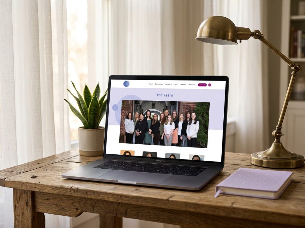
The visual identity matches the practice's ethos — self-compassion rendered in soft blues, warm neutrals, and open whitespace. Typography is approachable yet refined. Every page leads with reassurance: the hero invites reflection, the service cards feel like a conversation, and the therapist-matching flow turns anxiety into anticipation. The design never competes with the message — it amplifies it.