Brand & Design
2025
01
Design
01 / 03
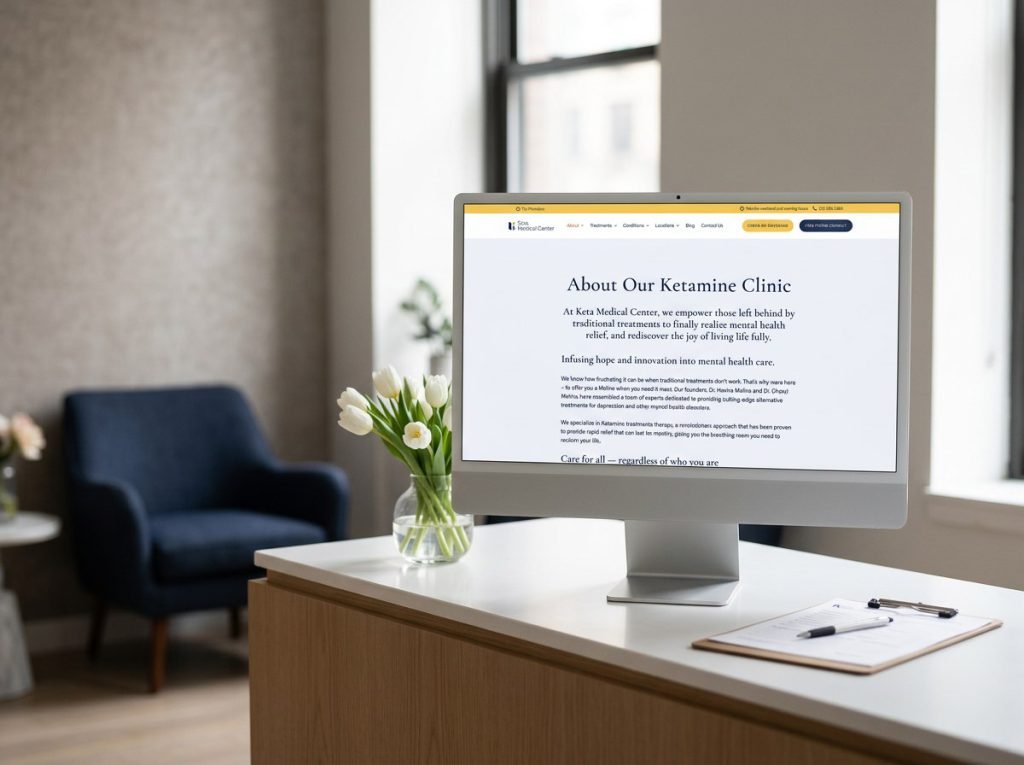
Calm, credible, and built for a vulnerable audience.
Notes
The design meets patients where they are — in a state of distress, scepticism, and hope. A soothing palette of soft blues and warm neutrals creates an immediate sense of safety. Generous whitespace and gentle typography signal clinical professionalism without feeling cold. Every layout decision reduces cognitive load: clear condition cards, scannable treatment comparisons, prominent trust signals (FDA-approved, physician-led, insurance-covered), and a testimonial stream that turns patient stories into proof. The result is a site that feels less like a clinic website and more like the first deep breath of relief.